Eerst had je PlayStation 3 in Spiderman lettertype, toen PS3 in Spiderman lettertype en met de PS3 Slim wordt weer een geheel nieuw lettertype gebruikt voor het logo. Maar wat is de reden nu voor deze rompslomp?
Kaz Hirai, de man die we allemaal kennen van zijn befaamde Ridge Racer uitspraak , legt het uit.
quote:
When you have PlayStation 3 spelt out, the aspect ratio was such that if you wanted it on a billboard it became tiny. It didn't work in terms of visibility. Currently the PS3 has "PLAYSTATION 3" in all caps and in a spiderman like font. Now its written "PlayStation" and Sony will use "PS3" and a new design for all slim consoles, possibly the new boot up screen for 3.0, and of course marketing on games such as Call of Duty: Modern Warfare 2. Having the bigger and more visible logo makes PS3 more dominant on third party titles that list Xbox as well.
Het komt er dus op neer dat het oude logo erg groot was, als je het op een billboard wilde zetten werd het erg klein. Het werkte gewoon niet als je het logo aan mensen wilde laten zien. Waarschijnlijk wordt het nieuwe logo ook gebruikt als startscherm met Firmware 3.00 en bij marketing met nieuwe games zoals CoD: Modern Warfare 2. Door het grotere en beter zichtbare PS3 logo maakt het meer dominant bij titels die ook de Xbox 360 als platform vermelden.
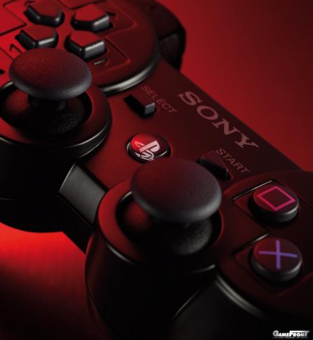
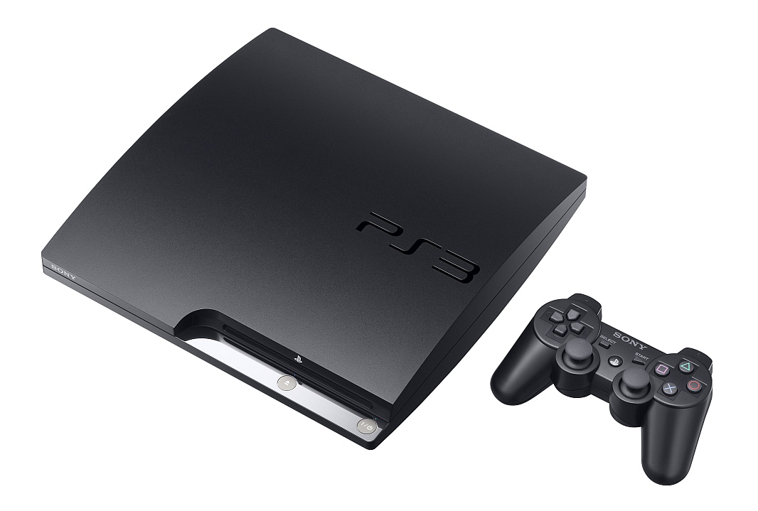 Het nieuwe logo in actie. Het nieuwe logo in actie.
|


 .
.
 En iedereen noemde het toch al PS3